Cova Health branding
Compliance
at it's best
Project Challenge
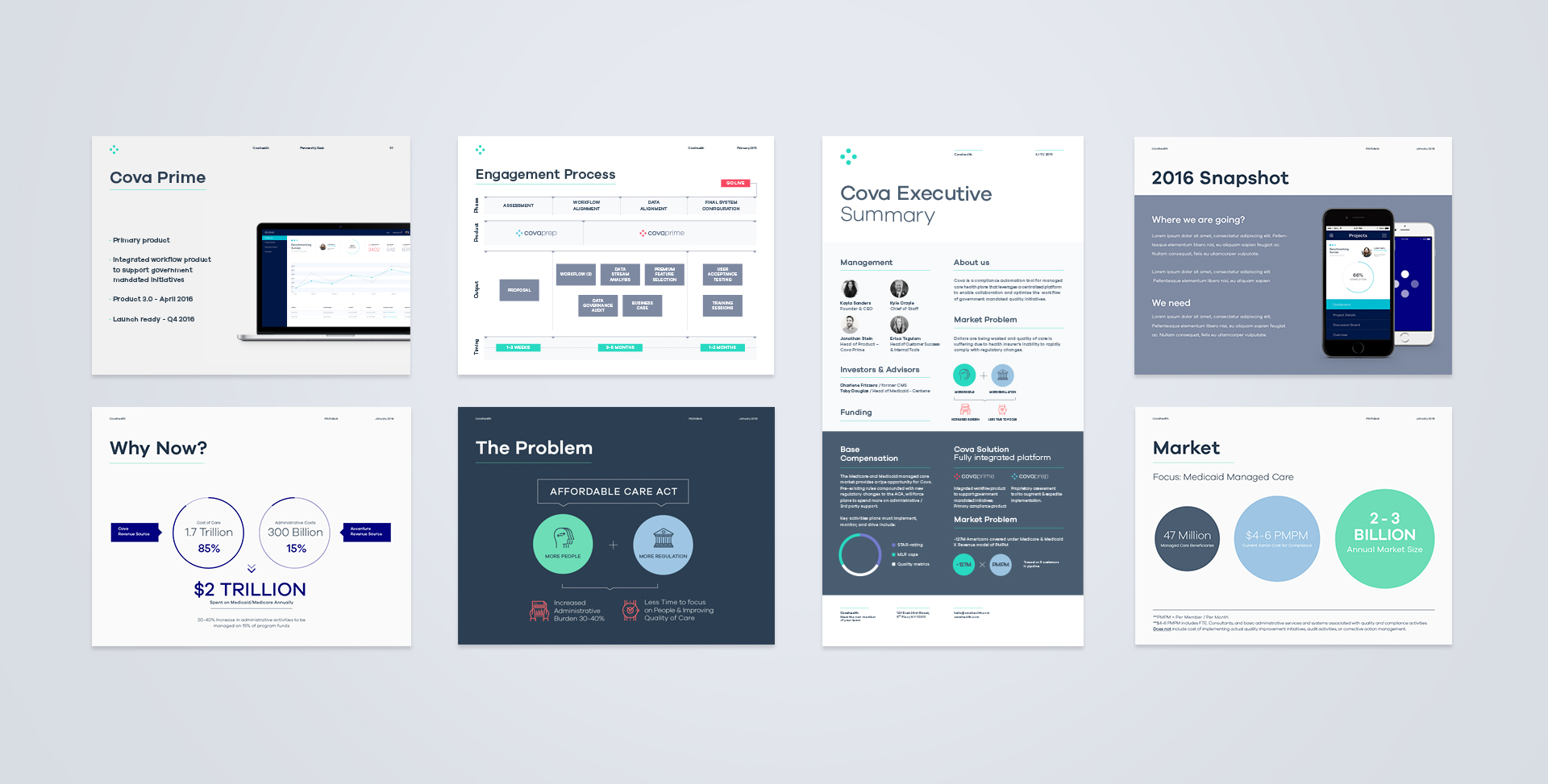
Conveying trustworthiness and the simplicity it will bring to Compliance Validation, to three very different target groups, was the main challenge of creating the visual language for Cova - a fresh, innovative company that makes the scene in these exciting times for US healthcare.
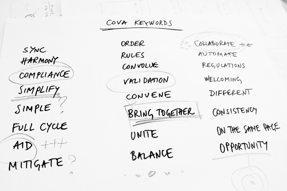

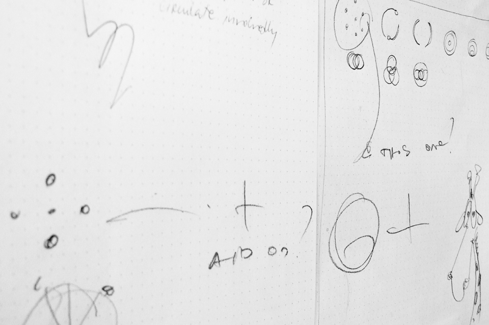

Branding
RESEARCH :: CONCEPT DEVELOPMENT :: BRAND STRATEGY
BRAND DEVELOPMENT :: PRINT :: WEB
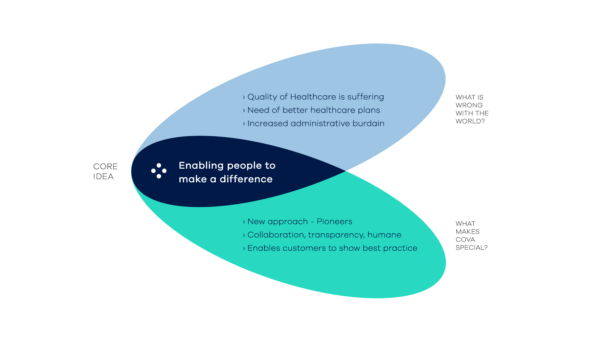
From the start it was clear that Cova needs a flexible logo and a rich color scheme that allow the brand to be reliable and trustworthy to C-Suite level executives, welcoming and friendly to End-users, clean and sleek in print and UI. Ultimatly it also needs to show its humane side, ability to enable collaboration, to support and aid people in healthcare, government and technology in order to stay on the same page, every step of the way.
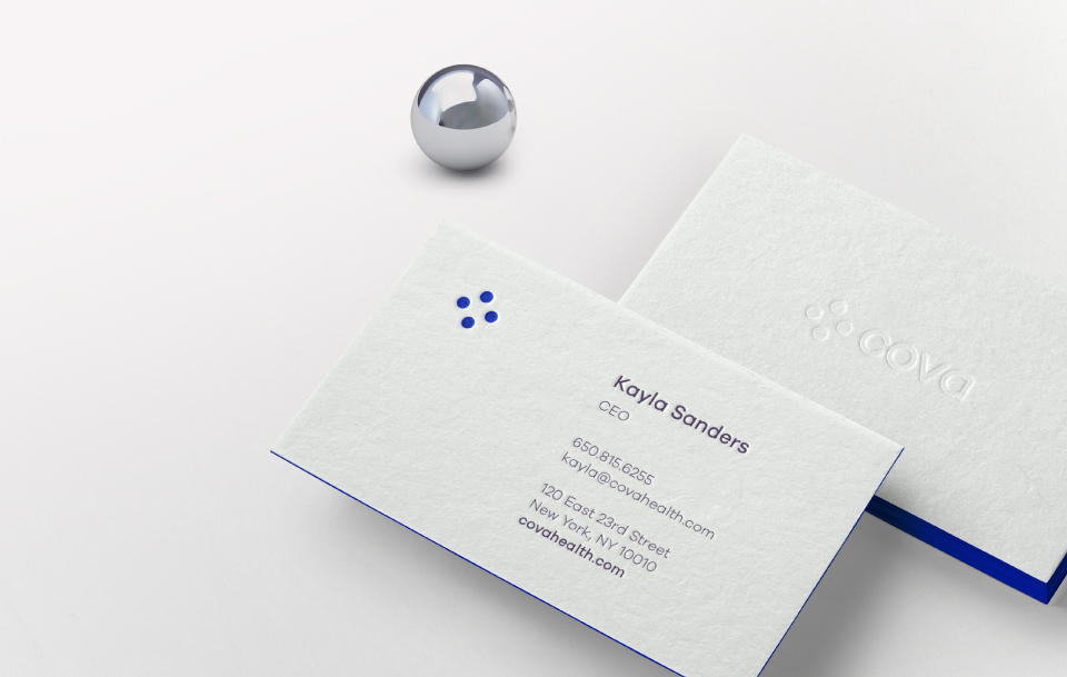

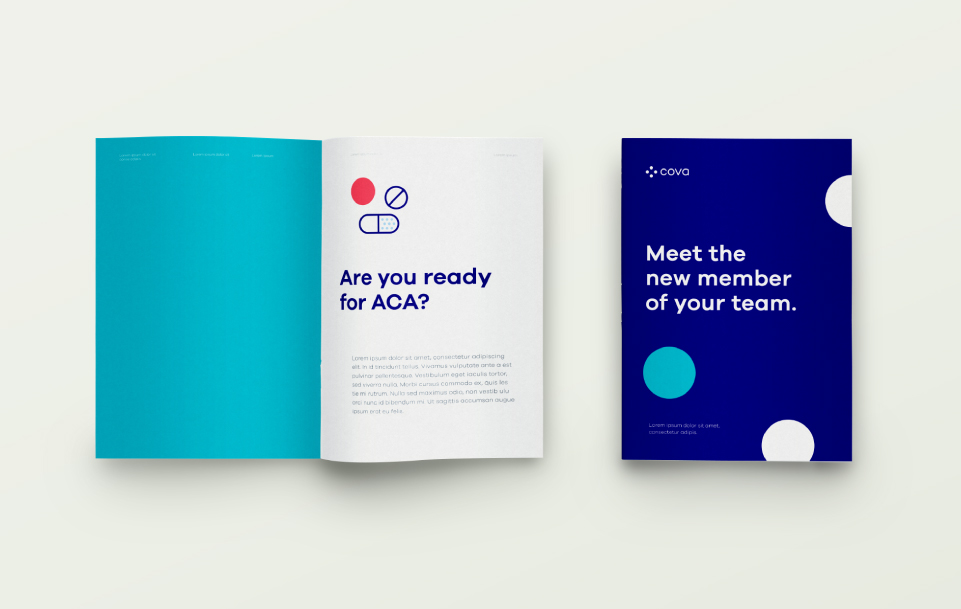


Product design
PRODUCT DESIGN :: UX DESIGN
UI DESIGN :: TOOLKIT
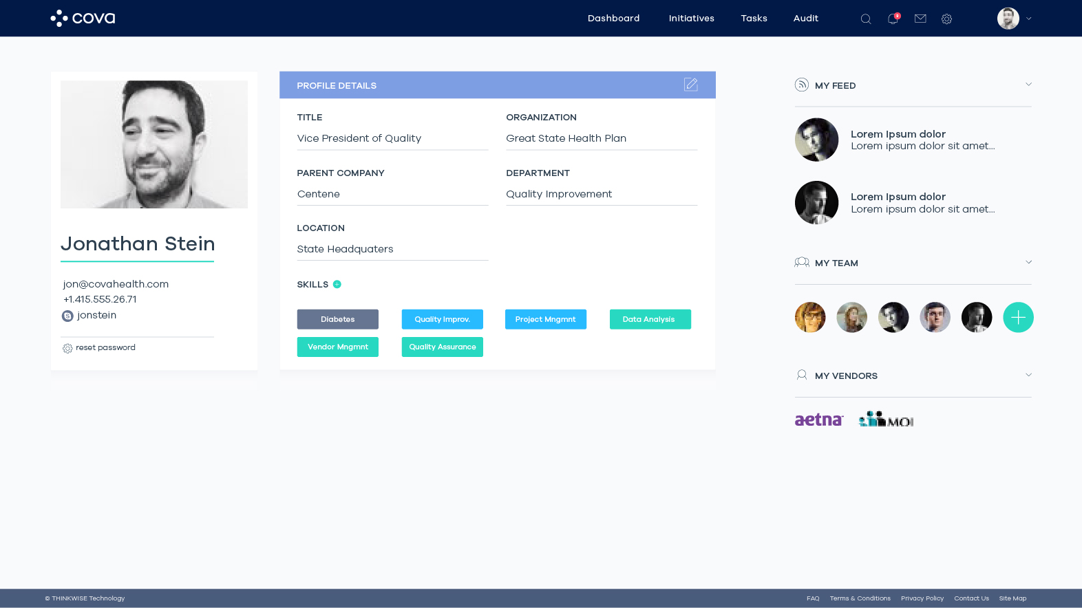
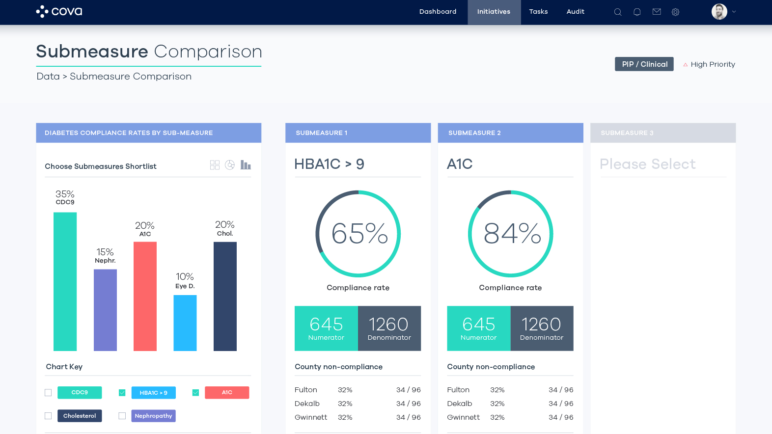
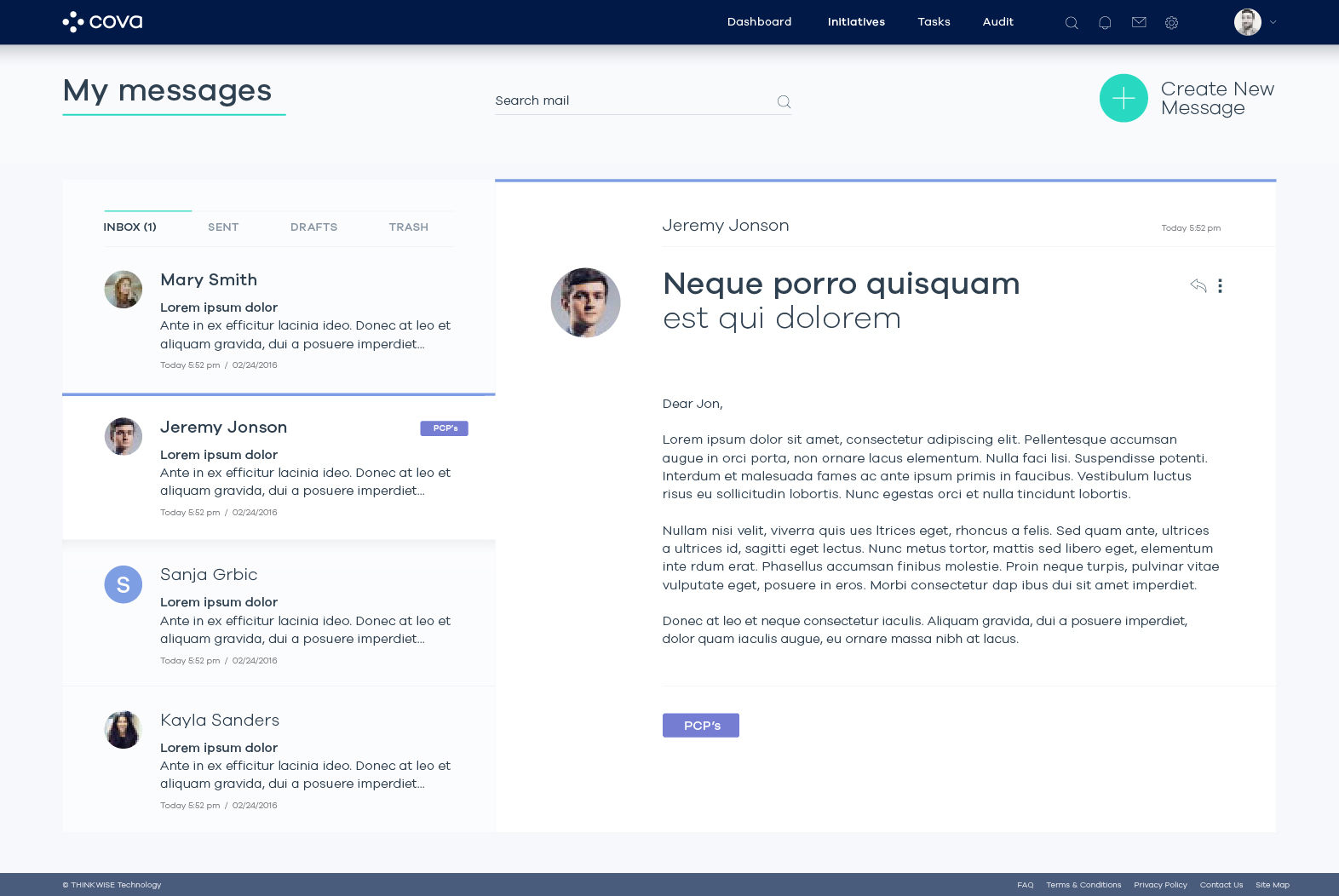
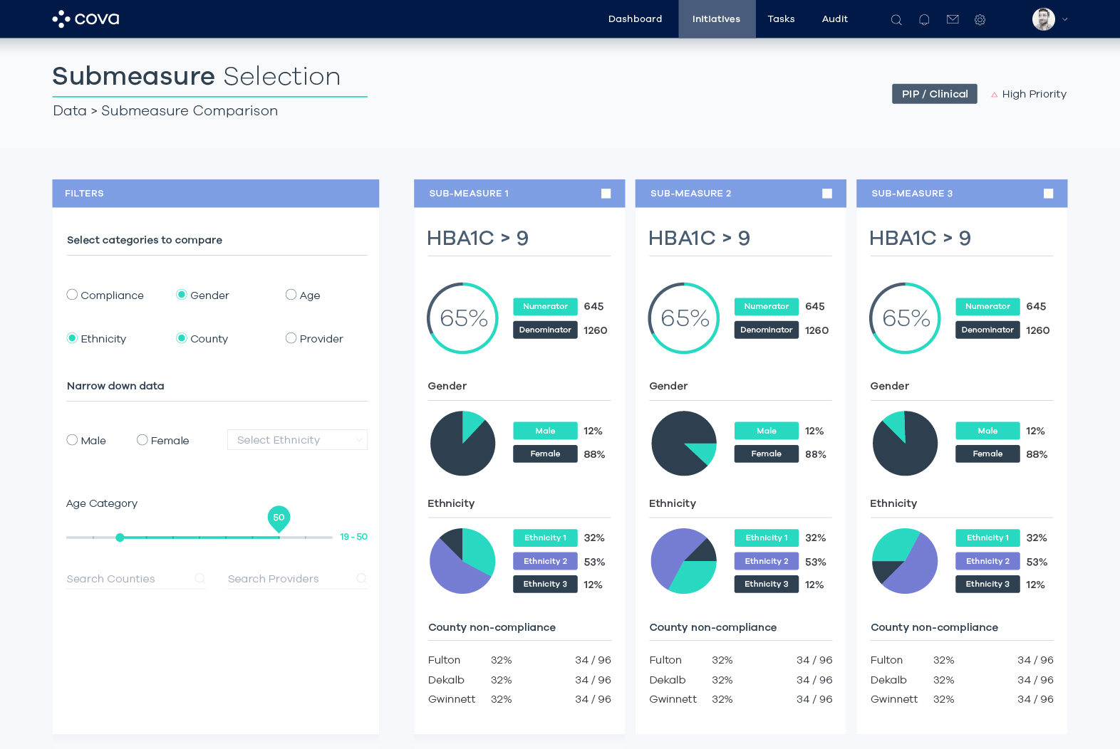
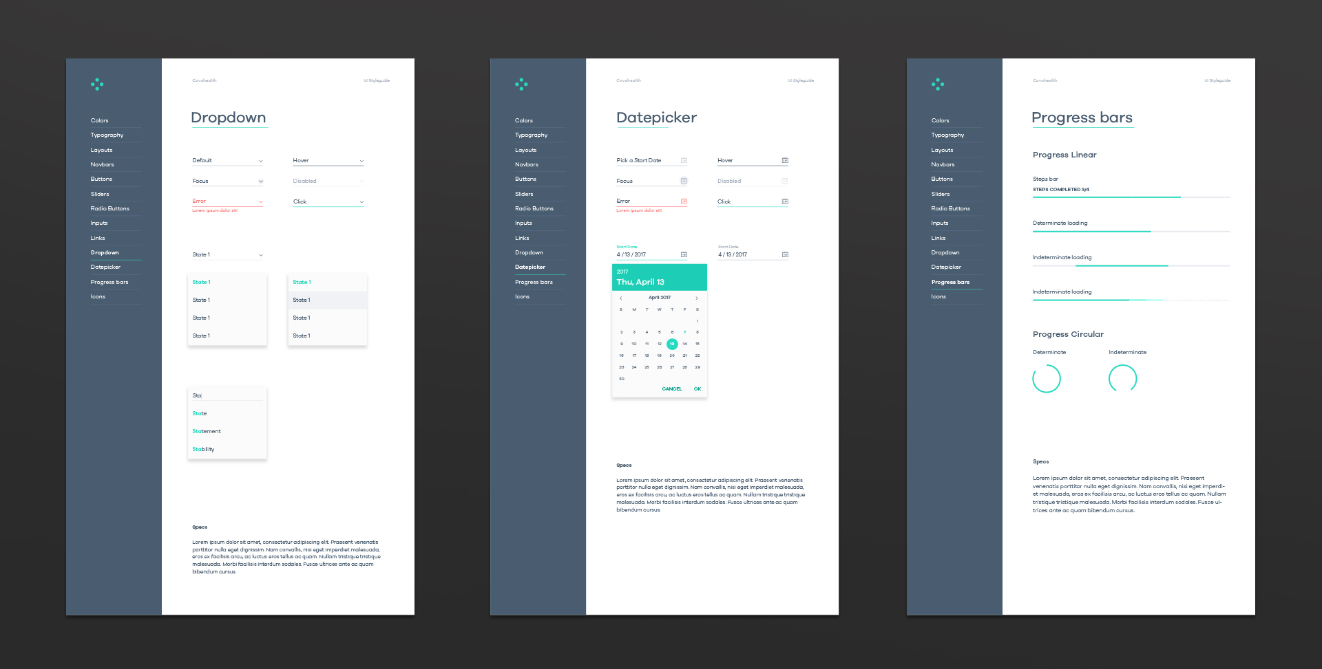
Great products take shape well below the surface, where strategy, logic, experience, and human nature fuel elegant and intuitive solutions. And the quickest route getting there is a proven collaboration process that brings our teams together.


UX / UI
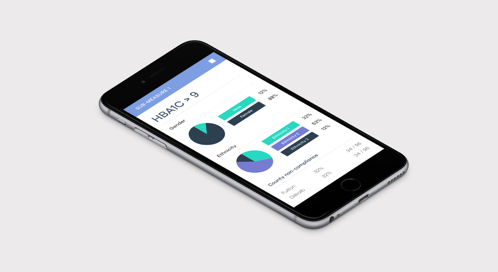
Making things look simple takes a lot of effort, this is fact we proved once again while working on the cova product design. Making such a complex product UX/UI to be easy to use and intuitive was probably the biggest challenge in this particular project.
